If you are like me, you like finding secret nooks and crannies of awesomeness on our dear college campus. The plentiful art shows are becoming one of my new favorite outlets for this awesomeness.
On April 18, the Honors Art Program hosted a reception for the second part of its annual show, which ran from April 15 to 19. “People Who Need People” featured work by Jack Aldrich, Demi Anter, Alex Givens, Megan Ogle and Emerald Vernon-Lapow. It was also the inaugural show for the newly renovated Arts Building’s gallery, a brand spankin’ new art hub located close to the Art, Design & Architecture Museum.
Having never been to a UCSB art show before, I didn’t quite know what to expect. Sure, I’ve loitered around my fair share of art museums and am mildly obsessed with the Getty in L.A., but art shows produced by, for and with peers was new territory.
The space was pristine. White walls with piping crisscrossing the ceiling created a clean, industrial feel. The gallery, comprised of a medium-sized “glass box” room attached to a larger, walled-in room, was open and airy, with just enough Two Buck Chuck-infused conversation to provide a cheery atmosphere.
Vernon-Lapow created a series of collages marked by simple, gorgeous geometric forms and intertwining the human body with machinery. The sparse imagery seemed to be inspired by mythology. The collages were made from clippings of old National Geographic magazines, some of which dated back to the first decade of the 1900s. Vernon-Lapow has been collecting magazines from church sales and thrift shops for the last 10 years.
“What I love about Emerald’s work is that there is an entire iceberg of feeling in between the sparseness of the collage,” said fourth-year CCS literature student Alison Green. “I’m used to collaging being so clustered, but she uses such little space — it’s fun to try to unravel her mental process as she was doing this, figuring out which images connect people together and what would get the right emotional reaction.”
Givens went a more technology-infused route. One of his three pieces involved a book used as an interface. The analogue-printed book plugged into a Mac computer and showed the viewer different imagery onscreen when each page was flipped. The piece dealt with invasive technologies, like viruses, by linking how they destroy computers to organic, animal forms in the book.
Another source of invasion was Givens’ 3D point cloud images of viewers that stood in front of a Kinect, which fed their shapes into a computer program and projected them onto the wall in a slightly abstracted manner. Givens explained that the piece was about how increasingly vulnerable someone’s data — down to their actual physical shape in space — is in our world of rapidly growing technology.
Aldrich’s works were much more in the realm of hand-crafted objects. “How to Follow an Albatross” was a visualization of a conceptual issue; Aldrich came across “albatross” used as a metaphor in a music review: “It was an albatross he could not follow.” Not being familiar with the metaphor, he thought about the literal difficulties of following the large bird and created his piece as a model and monument to the process. A wooden pedestal was topped with a globe made of wood with metal scraps nailed in place as the continents next to a metal bird in flight.
Aldrich’s piece looked like something you would find in Aristotle’s office, only slightly unfinished. A gear mechanism (also completely built by the artist) allowed viewers to rotate the globe by pressing a pedal; but the globe moved in a jerky, unstable manner. However, when viewed alongside his other pieces — a series of scrappy sculptures topped with an orange, tape flag marked by the word “Sorry” in sharpie, and a video piece called “Holding a Handful of Water,” which depicted a spiffily-dressed Aldrich trying to do just that, using objects ranging from his hands to a toilet plunger to a canoe. It became clear that this “jenkiness” was an intended quality. All of his pieces worked together to send a message about the futility of human endeavors, art-making perhaps being one of them. But this actually made the pieces and their shortcomings quite charming and memorable.
Anter built structures that fostered intimacy. One was a 16 foot-long forest green box that was mounted to one wall and emitted light from several peep holes, evenly spaced and centered. Upon closer inspection, I realized that there were text and images inside the box, which could be read through the holes. The original story, titled “Otto the Cat,” was quirky and a little bizarre; it was essentially about a cat that kills a bird. But Otto is not your average cat, as seen in lines like: “Otto the cat made the best impersonations. In fact, if Otto took the time to impersonate a particular facial expression of yours, you knew you were in.” In the end, the story is about our desire to make animals and people be something that they are not; it’s about loving a thing that might disappoint or disgust you, despite your greatest efforts.
The spacing of the text made viewers aware of their proximity to each other every time they moved down the row to continue the story, stuffing their faces close to the box and bumping shoulders, providing the effect of peeking into someone’s secret life. Anter’s piece “Whenever you breathe out, I’m breathing in” also dealt with space, interactivity and intimacy. Two floating lengths of fabric hung parallel to each other, about shoulder width apart. People could walk through them and be immersed by the small environment they created within the larger space of the gallery. On the insides of the fabric were large, reddish splotches, illuminated by two bare hanging light bulbs that cast a warm light inside the fabric and created shadows of viewers visible on the outside. Anter explained that the imagery was drawn from her and her boyfriend’s relationship.
“My boyfriend has psoriasis, which causes these red patches on his skin. People are obviously very self-conscious about skin issues, even the smallest pimple, so that’s been hard for him to deal with at times,” said Anter. “But I love him and his skin — I think it’s beautiful. I wanted to abstract it by blowing it up, turning it into this visual element that wasn’t immediately recognizable, and put my skin on the opposite fabric. I hope people who walk through it will feel comforted by the closeness of the space and will also see the pattern — the skin — as beautiful.”
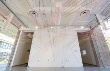
“Undeniable Connections” by Ogle, a maze of hundreds of neon pink, orange, purple and yellowish-green strings was probably the most monumental of the pieces in the show. Each string was carefully placed so that not one of them would touch, no matter how close they were. They explored tension and it turns out that they were placed to loosely reflect the twists and turns of one of Ogle’s friendships.
“I think [Ogle’s work] was about the reality of how we as humans are always just barely passing others by when we could be making important connections,” said Green.
The neatest thing about this show was just how different art can be for different people. Each student had to plan out and propose what they wanted to create for the show, and the executions were distinctly varied. There was the classic collage, the high-tech intertwining of interface and books, the woodworking construction, immersive fabric and text and a whirling maze of vibrant strings, but they somehow meshed together, leading viewers from one piece to another and creating a final, cohesive sense of community, connection, human ability and human shortcomings.
“People Who Need People” was a nook that I was immensely glad to have stumbled upon that Thursday night. Congratulations to the second group of this year’s Honors students for creating an engaging show.
NOTE: Check out this article in the Daily Nexus here:


Leave a Reply